Pypo.ai website audit
A review of the homepage, mobile experience, and onboarding.
Before
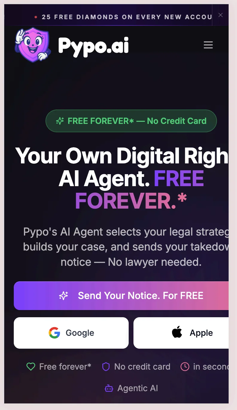
Audited mobile hero
After · Proposed
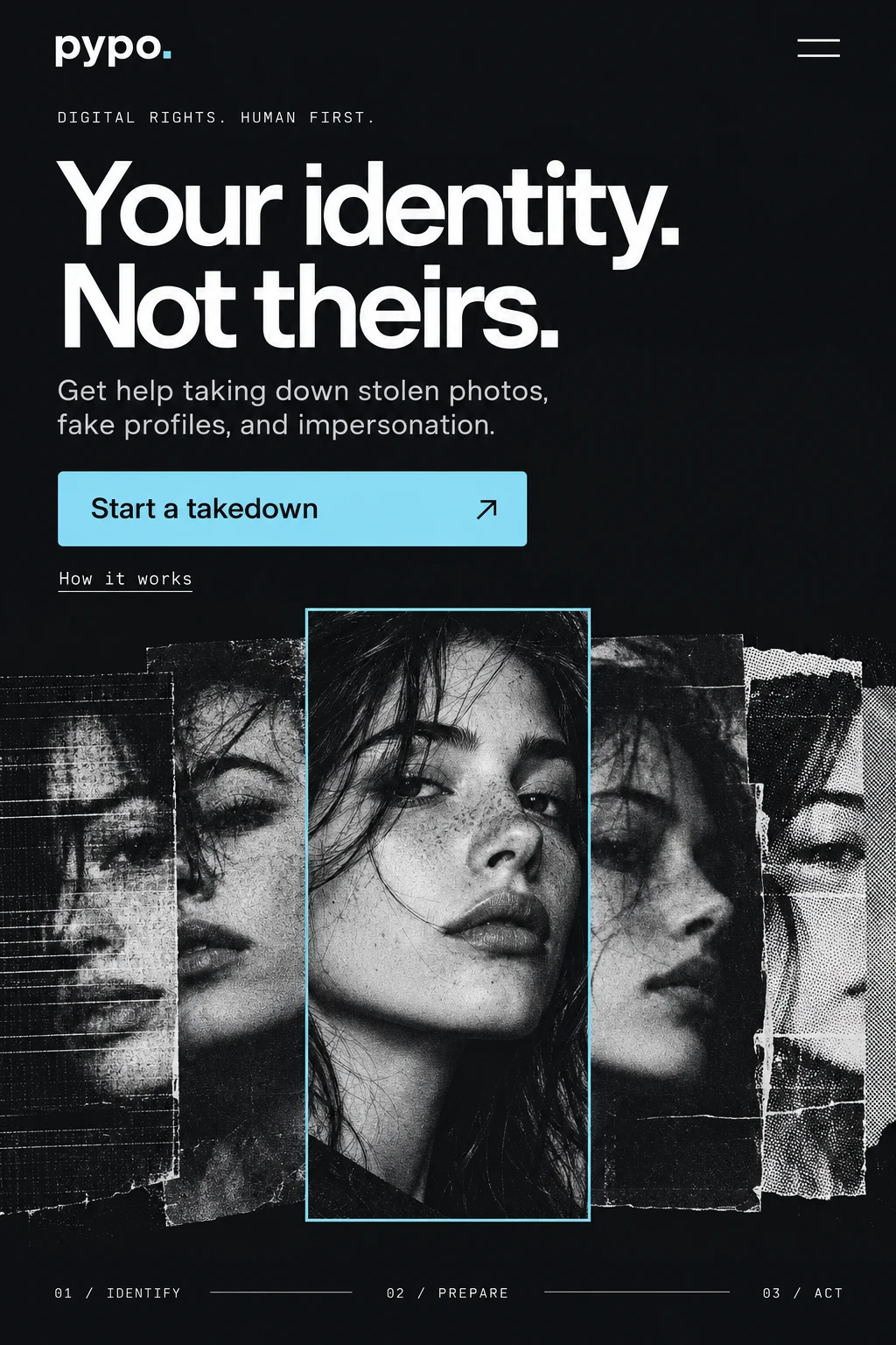
Proposed new hero
Select an image to enlarge
Contents
Category 01
UX and conversion
Problem 01
CriticalThe Watch Ad route blocks a high-intent action
Scan flow / Watch Ad
- Choosing Watch Ad in the scan flow returned an error.
- The failure occurred after a visitor had already chosen to move forward.
- There was no retry mechanism or fallback path.
- A free route that stops working creates a gap between the marketing promise and the delivered experience.
Why it matters. A person ready to proceed reaches a dead end. The experience fails to deliver the advertised route to value.
Recommended fix
- Reproduce the failure and investigate the ad-provider integration and response handling.
- Make loading, success, failure, and timeout states explicit. Give a useful explanation instead of leaving the flow stuck.
- Offer a retry action and a clear fallback when the ad cannot load. Preserve the user’s progress.
- Test across browsers and devices, including blocked requests and network failures. Confirm that recovery takes people back to the intended task.
How to check. Test successful, blocked, failed, and timed-out ad requests across supported browsers. Confirm people can recover without losing their work.
Problem 02
High priorityMessaging undersells the practical outcome
Homepage / hero
- “Your Own Digital Rights AI Agent” leads with a technology category.
- A visitor facing impersonation, stolen content, or a deepfake needs to recognize their problem quickly.
- The AI-agent concept can explain how the product works, but it does not immediately explain the help someone will receive.
- The message needs to connect the customer’s problem to a useful outcome.
Why it matters. Someone dealing with stolen photos or impersonation has to translate the product language before deciding whether it can help.
Recommended fix
- Test an outcome-led direction: “Remove stolen photos, fake profiles, and deepfakes faster.” Validate the comparative speed claim before using it.
- Use supporting copy to explain the workflow: “AI-powered takedown workflows for digital rights violations.”
- Show a clear next action and explain what happens after it, rather than relying on “AI agent” to communicate the whole product.
- Check whether people understand the difference between preparing or sending a notice and achieving a successful removal. Keep those expectations aligned.
A clearer mobile hero
Proposed design
Proposed new hero
A direct promise, one primary action, and a distinctive identity-focused visual. The proposed palette and type system also address the branding finding.
How to check. Ask representative users what the product helps them do and what they expect after clicking. Compare their answers with the actual flow. Test one message at a time; measure comprehension, qualified starts, and signup completion.
Problem 03
Strategic opportunityMonitoring is a strategic opportunity, but it is buried
Homepage / hero
- Monitoring for identity abuse is one of the strongest product opportunities.
- “Send Your Notice. For FREE” frames the experience around a reactive, one-time task.
- Monitoring could tell a broader story about detection, prevention, and ongoing protection.
- That shift could create a reason to return or subscribe. It is a positioning hypothesis, not a demonstrated retention result.
Why it matters. Visitors may understand a one-time task without seeing a reason to return.
Recommended fix
- Confirm which monitoring capabilities are available today, what they cover, and how frequently they run.
- Test protection-led, detection-led, and end-to-end messaging with the intended audience.
- Make the relationship between monitoring and takedown workflows understandable: finding a problem and responding to it are connected but distinct jobs.
- Test the copy directions below. Only promise automation, speed, coverage, or free access that the product actually supports.
How to check. Compare comprehension and qualified starts for monitoring and takedown messaging. Do not imply instant detection or guaranteed removal.
For problem 03 · Monitoring
Copy directions to test
Concepts to test. Confirm capabilities, speed, automation, and free access before using these claims.
A / Protection
Protect Your Digital Identity Automatically
AI monitors the internet for stolen photos, fake profiles, and deepfakes, and sends takedown notices for you.
Button: Start Monitoring
Check: Do people understand what is monitored and which actions happen automatically?
B / Detection
Know Instantly When Your Content Is Stolen
AI scans the internet for impersonation, stolen images, and fake profiles.
Button: Start Monitoring Free
Check: Does the product support the implied detection speed, coverage, and free access?
C / Full product story
Detect. Protect. Remove.
AI finds stolen content and automatically sends takedown notices.
Button: Start Monitoring
Check: Do people distinguish sending a notice from a guaranteed removal?
Problem 04
High priorityOnboarding is fragmented across modals
Onboarding / profile setup
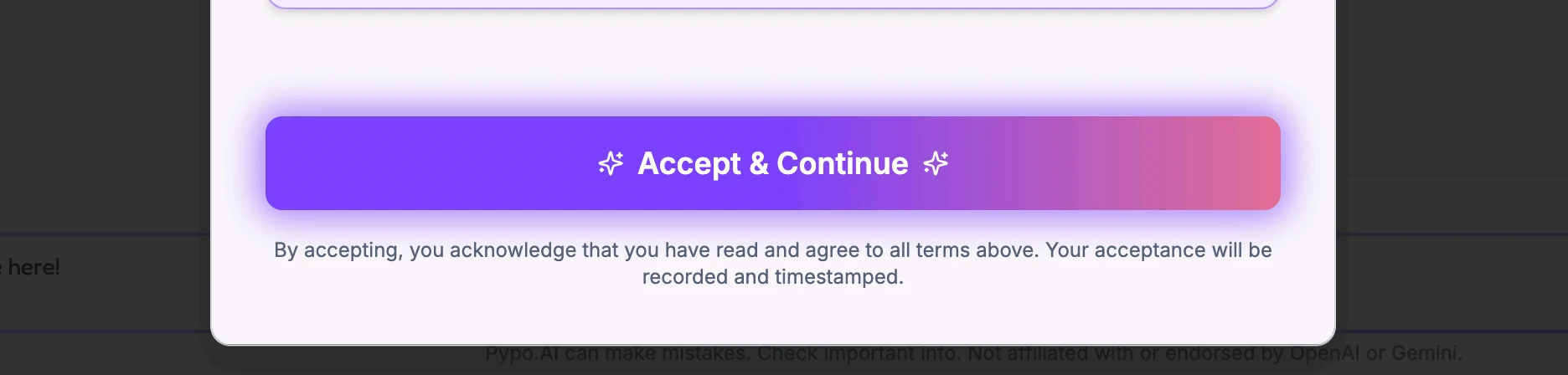
- Onboarding uses disconnected modal popups.
- There was no clear progression connecting welcome, disclosures, and profile setup.
- Profile-completion context appeared in settings, away from the beginning of the journey.
- The product explained that identity information supported the notice workflow, but that explanation needed to arrive when people were deciding whether to complete setup.
Why it matters. People may miss why setup matters or lose the thread between steps.
Recommended fix
- Create a cohesive three-step flow: welcome, disclosures, then profile setup.
- Show progress and explain what each step enables. Keep the amount of information requested proportionate to the task.
- Allow users to leave or skip where the product can support it, preserving the flexibility of the modal experience without losing their place.
- Explain why profile information is needed in plain language. Verify any claim about stronger notices with the product’s domain experts rather than presenting it as an assumed outcome.
Proposed design
Proposed new onboarding
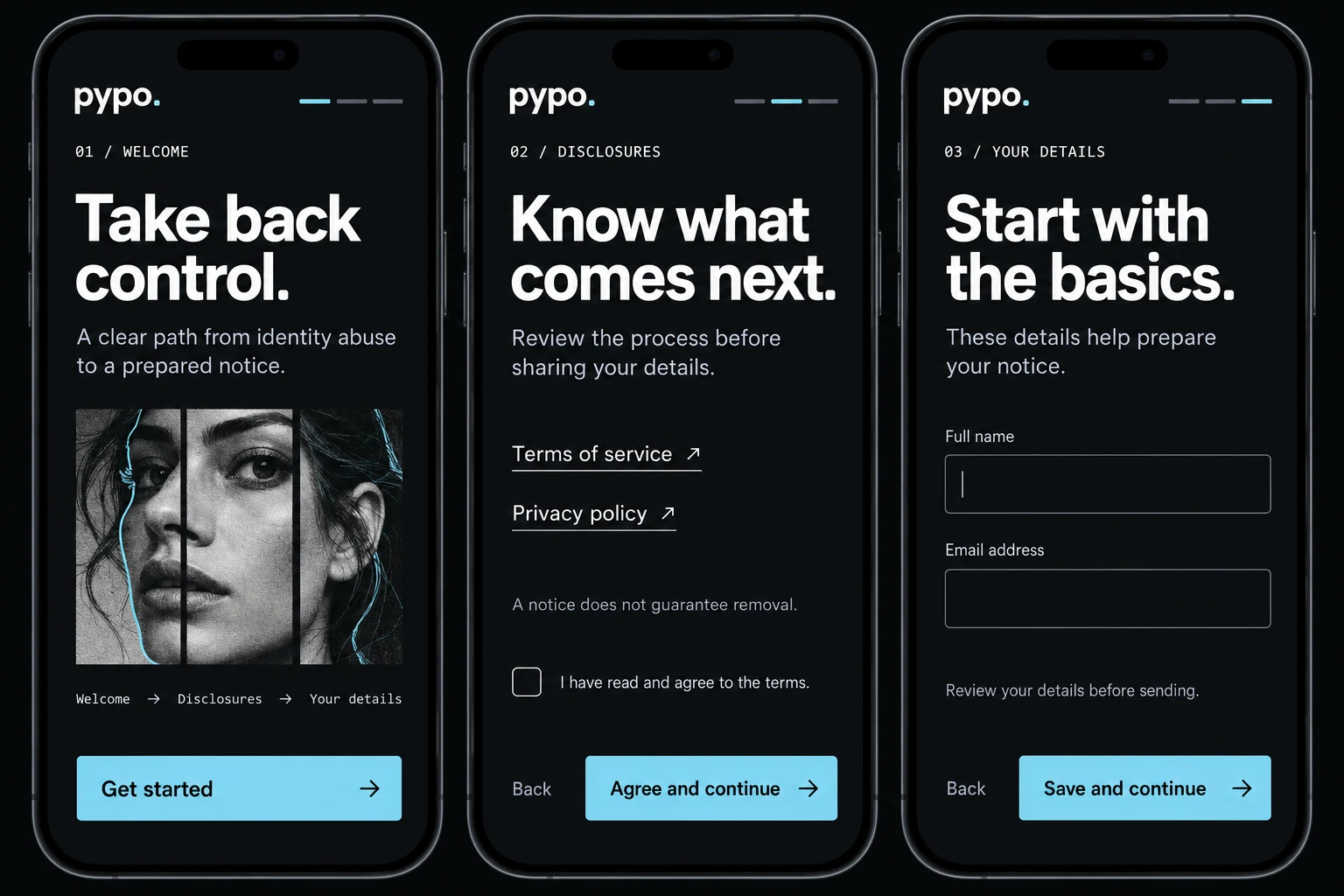
Welcome → disclosures → profile. Visible progress, consistent actions, and the reason for sharing information stay connected.
How to check. Observe first-time users completing setup. Track where they hesitate, exit, or need help, then compare setup completion, step-level exits, and errors with a connected-flow prototype.
Category 02
Visual and behavioral
Problem 05
CriticalMobile responsiveness
Mobile website
- The hero headline and supporting copy are partially cut off on mobile.
- Horizontal overflow means visitors cannot take in the full page at a glance.
- The primary action and some supporting elements extend beyond the visible width.
- Hierarchy becomes harder to scan when the layout no longer fits the device. In an identity-protection product, that can also undermine credibility.
Why it matters. People cannot read the promise or confidently take the next step.
Recommended fix
- Stack the hero in a deliberate order: headline, subheadline, primary action, then trust indicators.
- Use flexible containers that respect the viewport. Remove fixed widths and minimum widths that push content off-screen.
- Let large headlines wrap naturally. Check long labels, authentication buttons, and proof rows as well as the main heading.
- Verify the complete page on iPhone SE, iPhone 13, Pixel, and smaller Android screen sizes. Fix the underlying overflow rather than hiding clipped content.
How to check. At 320, 375, and 390 pixels, confirm that text and actions stay in view without horizontal scrolling. Check keyboard focus and text zoom too.
Problem 06
High priorityNavigation occupies too much screen space
Mobile website
- The navigation consumes a large part of the mobile viewport before visitors reach the product message.
- The mascot and wordmark lack enough visual separation from the content below.
- When scrolling, the sticky header blends into the product illustration and labels.
- A large header leaves less room for the headline, explanation, and next action.
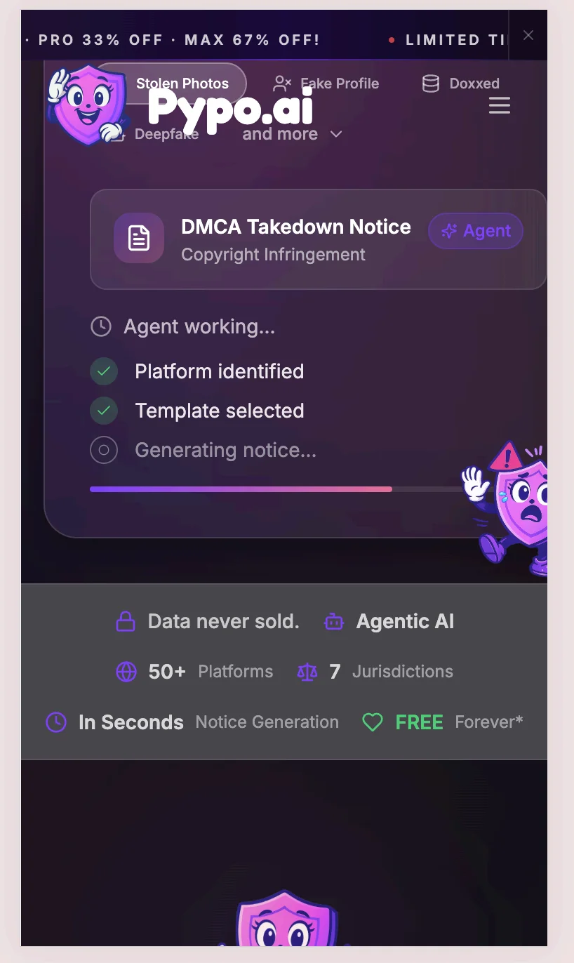
Why it matters. Navigation competes with the message people came to understand.
Recommended fix
- Reduce the mobile navigation height while keeping controls comfortable to tap.
- Give the logo a stable background container so it stays legible as content scrolls behind it.
- Apply a subtle, solid background to the sticky header on scroll.
- Check the top of the page and scrolled states, including the open menu. The navigation should remain useful without taking over the screen.
How to check. Scroll the full page on a small phone. Confirm that the header never obscures a heading, action, or focused element.
Problem 07
High priorityToo many elements compete above the fold
Homepage / hero
- The first view combines a promotional banner, navigation, hero text, a free badge, sign-in options, and trust indicators.
- Multiple offers and actions compete with the central product message.
- Repetition of “free” adds emphasis without necessarily clarifying the commitment or workflow.
- The result is a weak visual path: visitors must decide what matters before they can decide what to do.
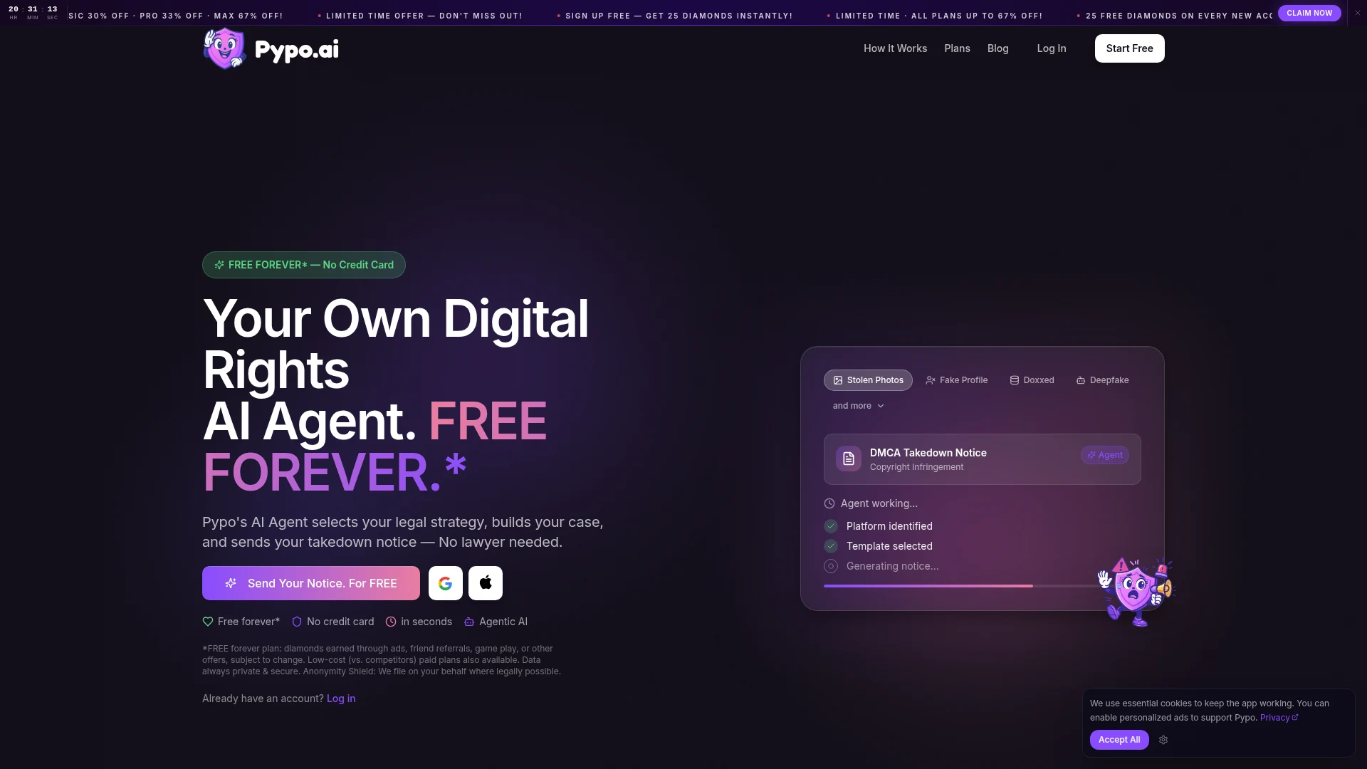
Why it matters. The interface asks people to filter the page before they can act.
Recommended fix
- Focus the hero on four elements: the problem, the outcome, one primary action, and one relevant trust signal.
- Move secondary promotions and supporting detail below the first view.
- Group secondary sign-in options so they support the main action instead of competing with it.
- Review every badge, banner, and repeated claim. Keep an element only if it answers a useful question at that point in the journey.
How to check. Ask users to find the first step without guidance. Compare first-click accuracy, hesitation, and downstream completion with the simpler hero structure.
Category 03
Trust and credibility
Problem 08
High priorityThe purple-gradient branding feels generic
Homepage / hero
- Heavy purple gradients and the cartoon mascot dominate the page.
- Our branding assessment: this treatment feels like a default AI-app template. It gives Pypo a vibe-coded appearance rather than a deliberate, distinctive identity.
- For people dealing with stolen content or impersonation, the visual language needs to communicate care, control, and credibility.
- The combination of gradients, promotional badges, and competing elements makes the brand feel generic. A more intentional visual system would help Pypo stand apart.
Why it matters. For an identity-protection product, a generic visual identity can weaken perceived care and credibility before users try the service. This is our design assessment to validate with users.
Recommended fix
- Replace the heavy purple gradients with a deliberate palette: crisp white or charcoal surfaces, strong ink-and-white contrast, and one restrained accent.
- Build recognition through typography, composition, and imagery rooted in identity protection instead of generic AI visual cues.
- Reassess the mascot’s role. Keep it only where it supports the tone and task; let the product promise lead at decision moments.
- Bring verified credibility signals into the relevant context: supported platforms, clear data practices, or substantiated usage evidence. Make existing trust claims clear and credible.
How to check. Ask users what makes them comfortable or hesitant about sharing information. Use only substantiated proof and product claims.
About this audit
- Date reference
- The March 2026 date is based on the audit page’s first saved version.
- Report refreshed
- October 4, 2026. Report presentation and proposed redesign concepts added.
- Method
- Expert review of the homepage, mobile experience, and first-use flows.
- Scope limits
- Findings reflect the website at the time of the audit. Recommendations and AI-generated redesign concepts have not been validated through implementation or outcome measurement. Concept visuals illustrate a proposed direction; they are not Pypo product screenshots or shipped work.