MoolAI website audit
A review of positioning, product explanation, mobile usability, and trust.
Before
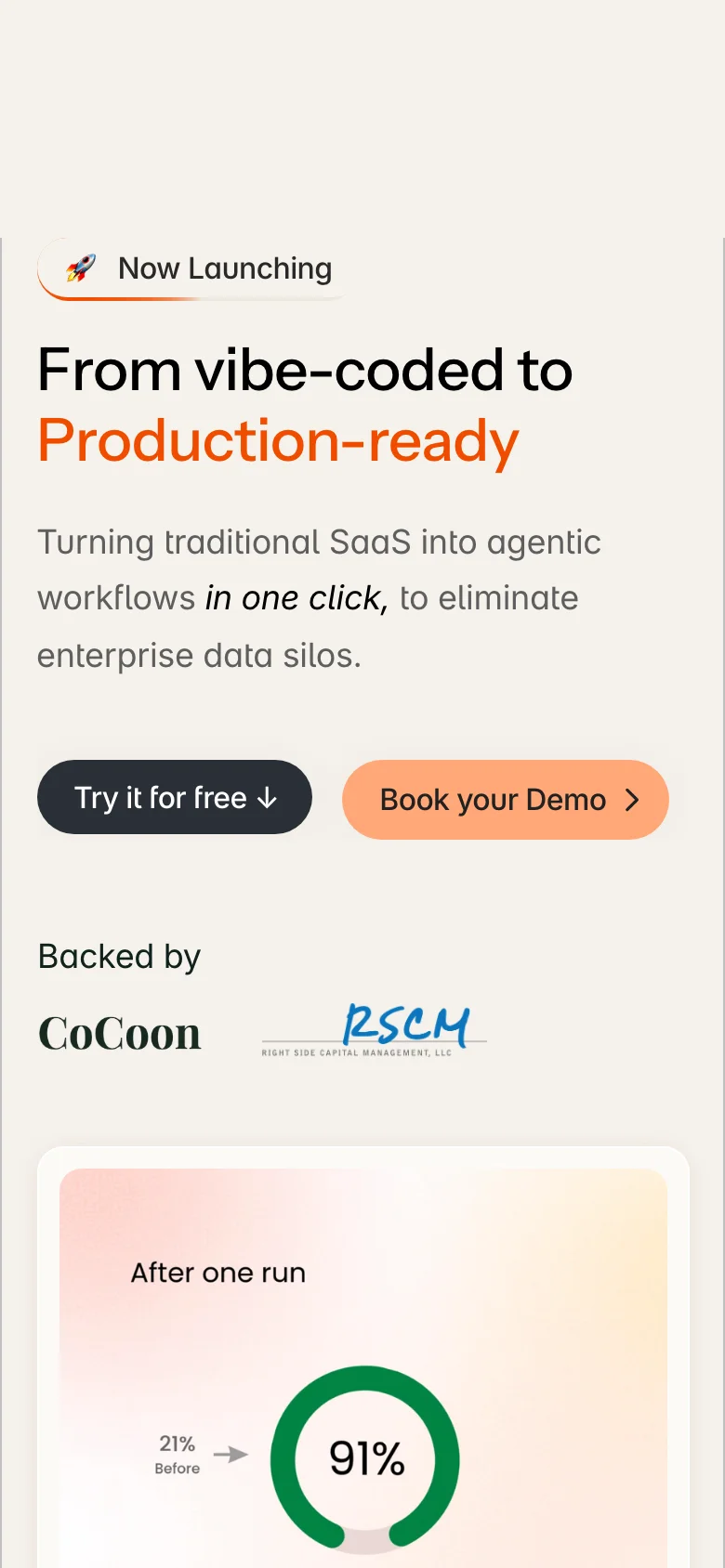
Audited mobile hero
After · Proposed
Proposed new hero

Select an image to enlarge
Contents
Category 01
UX and conversion
Problem 01
CriticalSay what MoolAI is.
Homepage / positioning
- “From vibe-coded to Production-ready” names a transformation, but not the product category or the buyer.
- The desktop copy calls it a self-serve platform. The mobile copy talks about converting SaaS into agentic workflows. Neither gives a clear, consistent explanation of the platform’s role.
- A score gauge cannot explain whether this is a testing tool, a consultancy, or a platform for governing and deploying enterprise agents.
Why it matters. Visitors have to infer what they are evaluating before they can decide whether it solves their problem.
Recommended fix
- Name the category above the headline: Enterprise AI agent platform.
- Explain testing, governance, and deployment in one plain sentence. Make the intended enterprise audience explicit.
- Keep the transformation hook where it helps, but support it with a visible workflow and an accurate description of the product.
- Use a next step that matches the access actually available. The proposed hero leads with a demo.
Proposed design
Proposed new hero
A clear category, one next step, and a distinctive visual for moving agents into production. Pair this with the proposed product section below to explain the actual workflow. See product visibility and button hierarchy.
How to check. Show the first screen to representative enterprise buyers. Ask what the product is, who it serves, and what happens after the primary click. Compare their answers with the actual product.
Problem 02
High priorityMake the launch badge lead somewhere useful.
Hero / announcement
- The “Now Launching” badge opens an email composer through a mailto link.
- The badge names no release or capability and provides no launch information.
Why it matters. An announcement-like control unexpectedly asks visitors to write an email. It interrupts discovery at the top of the page.
Recommended fix
- Link to a real launch post, release note, or new capability, and name it in the badge.
- If contact is the intended action, label it as contact. If there is no announcement, remove the badge.
How to check. Activate the badge with touch, mouse, and keyboard. Confirm that its label accurately predicts the destination.
Problem 03
High priorityTranslate technical features into useful outcomes.
Features / process
- The site says the platform is simple enough for domain experts, then leads with “Compiled Guardrails” and a formal verification engine.
- Other explanations depend on OAuth delegation, deterministic policy compilation, and an LLM Council with a closed-loop improvement cycle.
- These mechanisms may matter to technical evaluators, but a shipping, pharmacy, or finance specialist still needs to understand what changes in their work.
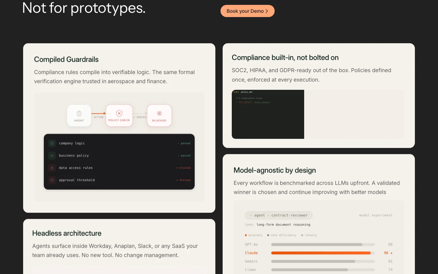
Why it matters. Technical depth is harder to value when the buyer cannot connect it to a task, risk, or decision.
Recommended fix
- Lead each feature with the user outcome, then explain its mechanism in a supporting line.
- For identity controls, show whose permissions an agent uses. For human review, show which action pauses and who approves it.
- Keep technical terms available for engineering review without making them the only explanation.
- Use the existing identity and approval diagrams as the foundation for a clearer product section.
Proposed design
Proposed product section
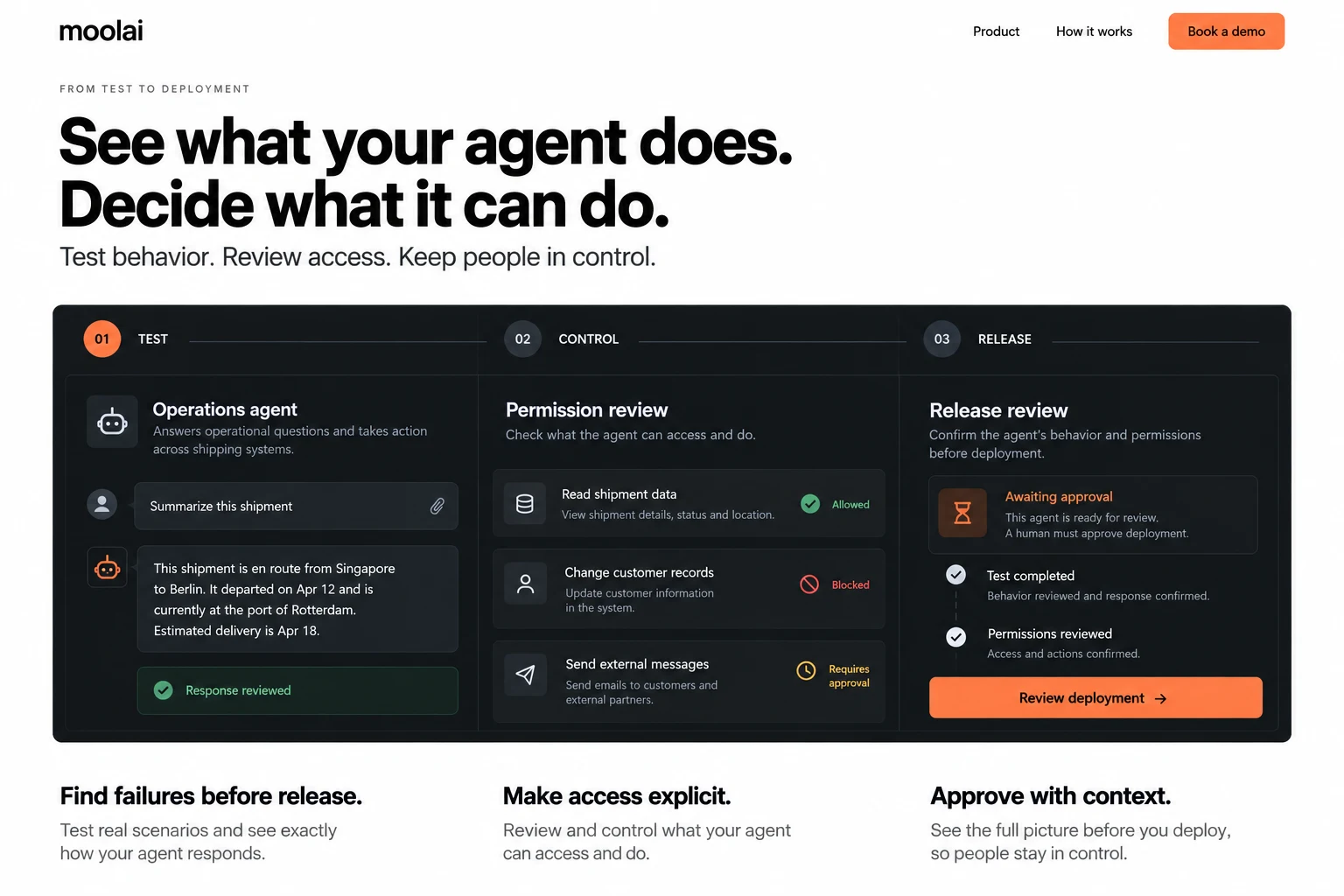
Test behavior → review access → approve release. The interface explains the mechanism alongside the benefit. Confirm the workflow details against the product before adopting this direction.
How to check. Ask domain experts to explain each feature in their own words and identify a situation where they would use it. Keep technical reviewers in the test too.
Problem 04
High priorityMatch the offer to the next step.
Hero / conversion path
- The desktop copy says “self-serve” and the hero offers “Try it for free” with a downward arrow.
- The process, feature, and closing sections offer demo booking. The saved review did not establish a clear direct trial path.
- The closing line “Stop building demos. Start shipping agents.” is followed by a demo-booking action.
Why it matters. People expecting immediate access may meet a sales step instead. The page sets an expectation it has not clearly supported.
Recommended fix
- Trace the free-trial action end to end and confirm what access is actually available.
- If a self-serve trial exists, link directly to it and state its limits. Keep demo booking secondary.
- If a call is required, make Book a demo the primary action and remove language implying immediate self-serve access.
- Explain what the call covers and what happens afterward.
How to check. Complete both paths as a new visitor. Compare the button promise with the destination, access requirements, and confirmation message.
Problem 05
High priorityTell the same story on every screen.
Desktop and mobile / hero copy
- Desktop describes taking vibe-coded AI agents to production, stress-tested and optimized.
- Mobile instead promises to turn traditional SaaS into agentic workflows in one click and eliminate enterprise data silos.
- These describe different jobs, while the scorecard visual remains focused on agent readiness.
Why it matters. The product’s meaning changes with the visitor’s screen size. Shared links and cross-device evaluation become inconsistent.
Recommended fix
- Choose one supported value proposition and use the same content source on both layouts.
- Shorten mobile copy only where the meaning stays intact.
- Move secondary benefits lower on the page and explain how they relate to the core workflow.
How to check. Compare rendered copy at mobile, tablet, and desktop widths. Ask buyers on each device what the product does; look for a consistent understanding.
Problem 06
High priorityExplain the cost of getting started.
Navigation / pricing / trial
- The page offers a free trial and claims 30–60% AI cost reduction over time.
- The saved review found no pricing link in the navigation or footer and no explanation of free-access limits or paid upgrades.
Why it matters. Buyers cannot judge whether the product fits their budget or what commitment follows the first step.
Recommended fix
- Publish the actual commercial model: available plans, a starting point where appropriate, or how enterprise quotes are scoped.
- Explain trial duration, included capabilities, usage limits, and what triggers payment, if a trial exists.
- Link this information from navigation and nearby conversion points. Substantiate cost-saving claims separately.
How to check. Ask a buyer to find the access conditions and explain what could cost money. Confirm that the page agrees with the sales and signup experience.
Problem 07
High priorityShip fewer bytes for the same experience.
Page assets / loading
- The saved scan recorded 88 requests and about 2.8 MB transferred, above that audit’s chosen budget of 80 requests and 2.5 MB.
- It flagged 18 oversized image instances, including 225px assets displayed at 46px and a 249px-wide asset displayed at 84px.
- The same run recorded an 800ms first contentful paint and a 2.8s load. These are measurements from that run, not a current performance baseline.
Why it matters. Unnecessary asset weight adds avoidable work on slower connections, even when one desktop test loads quickly.
Recommended fix
- Serve responsive image sizes appropriate to display width and pixel density. Use modern formats and the existing image pipeline.
- Review duplicate requests, unused assets, and nonessential scripts before adding new performance work.
- Load lower-page imagery lazily while prioritizing the actual hero image.
- Set a realistic page budget and compare before and after under the same test conditions.
How to check. Repeat the network and loading audit on a throttled mobile connection. Compare transfer size, request count, largest contentful paint, and visual stability across several runs.
Category 02
Visual and behavioral
Problem 08
CriticalShow how the product earns the score.
Hero / product demonstration
- The desktop fold devotes its main visual to a 21% readiness gauge. The mobile example progresses to 91% after one run.
- The named risks make the scorecard useful supporting material, but it does not show the interface or the work behind the result.
- The explanatory seven-stage process and the identity and approval mechanisms sit much farther down the page.
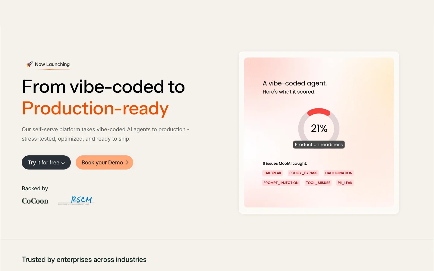
Why it matters. The strongest product explanation arrives after the first impression. The score asks buyers to accept an outcome before understanding the mechanism.
Recommended fix
- Promote a real interface or a concise workflow into the first screen.
- Show a test, a permission decision, and a release review so visitors understand what they can actually do.
- Keep the gauge as supporting evidence with context for what the score means and how it was calculated.
- Preserve the useful Describe → Architect → Experiment → Secure → Connect → Deploy → Improve sequence, with detail below the hero.
How to check. Ask viewers to describe the workflow after seeing the hero. Check that they understand the score’s scope and do not interpret it as a guarantee.
Problem 09
High priorityBuild the visual identity around the product.
Branding / page-wide art direction
- The pale background, soft orange pills, and alternating dark sections use a familiar AI-startup visual pattern.
- The more distinctive per-user identity and human-review diagrams appear small and midway down the page.
- Our design assessment: the surface undersells the specificity of the product. This is a perception hypothesis to validate, not a claim that a particular color reduces conversion.
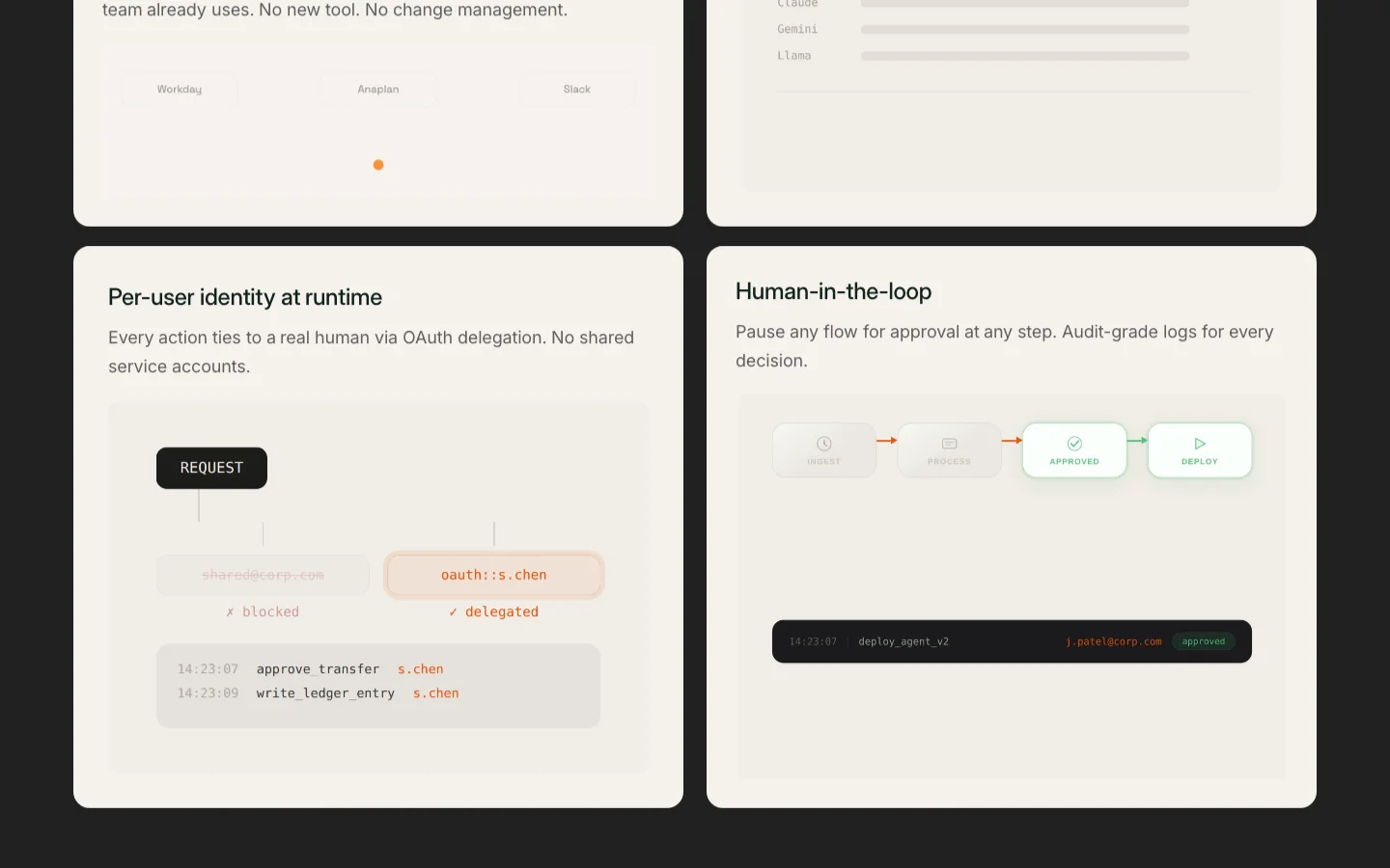
Why it matters. A skimmer sees familiar styling before seeing the product’s distinctive mechanisms.
Recommended fix
- Build a consistent visual language from permission boundaries, workflow states, and approval trails.
- Use deliberate type scale, spacing, and contrast to establish hierarchy instead of adding more decorative panels.
- The proposed direction uses ink, crisp white, and a restrained orange accent. Carry it consistently across the hero and product explanation.
- Keep the useful technical diagrams and make them legible enough to explain the product.
How to check. Compare recognition, comprehension, and perceived credibility with target buyers. Ask what they remember about the product, not only which palette they prefer.
Problem 10
Medium priorityMake the primary action visually primary.
Hero / button hierarchy
- “Try it for free” is a quiet dark-navy button, while “Book your Demo” has the brighter orange fill.
- The visual emphasis favors the demo while the surrounding language promotes self-serve access.
Why it matters. The message and visual hierarchy point toward different next steps.
Recommended fix
- Resolve the access model in problem 04 first, then give that action the dominant treatment.
- Use a quieter link or outline for the secondary action.
- Repeat the same action name and hierarchy through the page instead of changing the offer by section.
How to check. Run a first-click task with a specific intent. Check which control visitors notice and whether it takes them to the path they expected.
Problem 11
Medium priorityMake every customer story readable.
Testimonials / looping carousel
- Seven named organizations appear in the testimonial material: Blackstone Shipping, Nova Health AI, Right Skale, Keycentrix, Protecto, Anetac, and Numero.
- Their headings repeat three times in the saved markup, consistent with a looping marquee implementation.
- The stories contain specific workflows and constraints. Repeating the loop does not add more evidence.
Why it matters. Movement can make useful proof harder to finish reading and harder to revisit.
Recommended fix
- Present the seven distinct stories in a readable grid or a manually controlled carousel.
- Retain attribution and the specific workflow details, with permission and verification for any published outcome claims.
- If a loop remains, provide pause controls and respect reduced motion. Keep duplicated slides out of the accessibility tree and keyboard order.
How to check. Read a full quote using touch, keyboard, and a screen reader. Confirm that each distinct story is accessible without chasing the animation.
Problem 12
Medium priorityGive mobile actions more room.
Mobile / navigation and buttons
- At a 390px viewport, the scan flagged 15 interactive elements below its 44px touch-target guideline.
- Demo buttons measured 43px, 40px, and 40px tall; the free-trial button measured 40px.
- Other examples included the brand at 120×31px, Contact Us at 106×34px, Blog at 62×34px, and the launch badge at 172×32px.
Why it matters. Small or closely spaced hit areas make precise tapping harder at important decision points.
Recommended fix
- Use a comfortable minimum 44×44px hit area for standalone controls in this design, adding padding rather than enlarging every label.
- Keep enough separation between neighboring targets and preserve visible focus states.
- Apply the change to header links, badges, and repeated CTAs, not only the first hero button.
How to check. Measure the interactive hit areas at 320px and 390px widths. Try adjacent actions one-handed and confirm that larger targets do not create overflow.
Problem 13
Low priorityKeep the document outline in order.
Process / testimonial headings
- The saved code review found two heading-level jumps from h2 to h4: “Describe” and “Blackstone Shipping”.
- Visual size and semantic heading level are separate choices.
Why it matters. An inconsistent outline makes the section relationships harder to follow when navigating by headings.
Recommended fix
- Use one clear page heading, then category and subsection levels that represent the actual hierarchy.
- Change the process and testimonial subheadings to the appropriate level. Preserve their visual appearance through CSS.
- Review the complete heading list after the change rather than checking only these two nodes.
How to check. Navigate the page by headings with a screen reader and inspect the document outline. Confirm that each heading describes its section.
Category 03
Trust and credibility
Problem 14
CriticalMake the trust information easy to find.
Footer / privacy and terms
- The review found no links to privacy, terms, or cookie information on the audited page. The footer linked Home, Contact Us, Blog, and LinkedIn.
- The page nevertheless used SOC2, HIPAA, and GDPR-ready language while addressing regulated enterprises.
Why it matters. Buyers evaluating governance cannot easily inspect how the vendor explains its own data practices and service commitments.
Recommended fix
- Publish accurate privacy and service terms with the appropriate internal owners and link them consistently from the footer.
- Explain data handling and provide a clear contact route for security and procurement questions.
- State the scope and evidence behind each security or compliance claim. Distinguish readiness language from independently verified certification.
How to check. Follow the policy and trust links as an enterprise evaluator. Confirm that they load, apply to the relevant service, and answer the questions the marketing claims raise.
Problem 15
High priorityExplain what the site collects.
Scripts / privacy controls
- The saved scan detected a request to googletagmanager.com on page load and found no visible privacy disclosure or consent control.
- A tag-manager request alone does not establish which tags ran, what data they collected, or whether consent was required.
Why it matters. The visible experience gives buyers little information about the site’s data practices, especially on a page centered on governance.
Recommended fix
- Inventory the configured tags, storage, recipients, and actual data flows before deciding which controls are needed.
- Explain those practices in the privacy information. Provide meaningful choices and gate nonessential activity where applicable.
- Ensure rejecting or changing a choice works and that the interface reflects the actual script behavior.
How to check. Inspect network and storage before any choice, after acceptance, after rejection, and after changing preferences. Have the responsible privacy owner confirm the applicable requirements.
Problem 16
Medium priorityGive every statistic a source.
Proof / enterprise AI statistics
- The page presents 87% of enterprise AI initiatives not lasting in production, less than 5% back-office adoption, more than 70% without governance, and 2× rework cost without visible citations.
- The “1 Day” metric has a “MoolAI customer avg, 2026” label, which gives some context but not its sample or measurement method.
- The 30–60% cost-reduction claim also needs enough context for a buyer to judge its relevance.
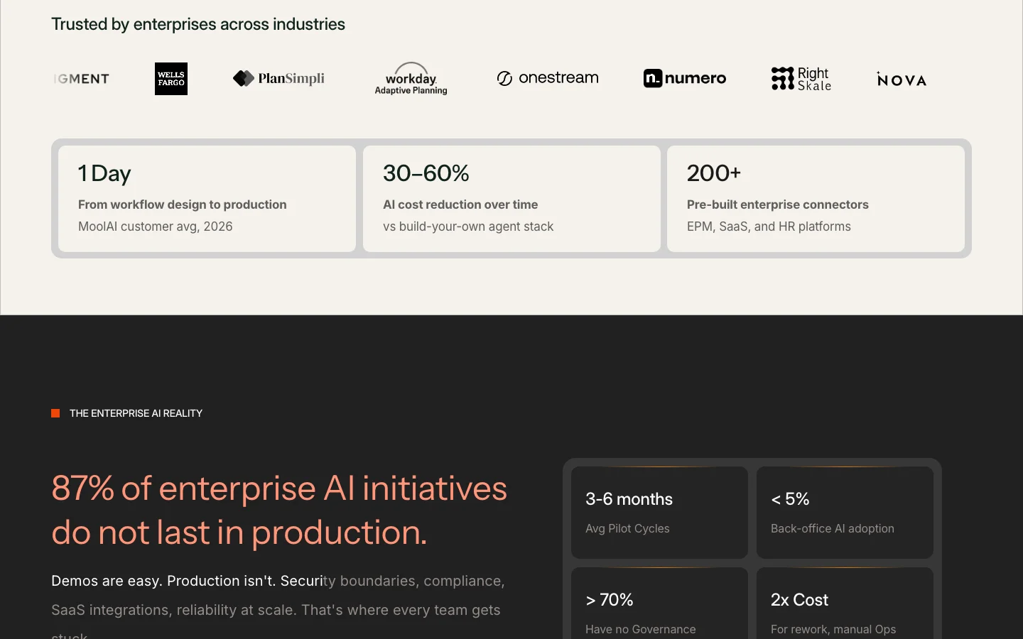
Why it matters. Strong numbers can weaken credibility when readers cannot inspect their basis or tell whether they apply to their situation.
Recommended fix
- Link external figures to the underlying source and give the publication date and relevant scope.
- For internal metrics, identify the period, sample, definition, and calculation method.
- Remove numbers that cannot be supported. Do not present illustrative scorecard changes as independently verified customer results.
How to check. Trace each number to its source. Check that the wording, population, timeframe, and calculation agree with what is being claimed.
About this audit
- Date reference
- August 23, 2026, as recorded in the saved audit.
- Report refreshed
- October 4, 2026. Report presentation and proposed redesign concepts added.
- Method
- Expert review and saved code scan of the homepage at 1440×900 desktop and 390×844 mobile in Chromium. Repeated findings are consolidated into 16 problems.
- Scope limits
- Findings and measurements reflect the saved audit, not a new scan of the current site. Proposed designs illustrate our recommended direction. Trust findings are a transparency review, not a compliance determination.