Why You Should Invest in Good Web Design
A founder considering a new site often asks a fair question: if a template or an AI generator can produce something that looks finished, why pay for design? The page comes together in an afternoon.
Visitors land with one job, to decide whether you are worth the next click, the next form, or the next meeting. They form that impression before they have read a paragraph. If the page looks generic, if the offer takes work to decode, or if three buttons compete for the same decision, they leave. Sales then spends the week explaining what the homepage should have said on its own.
We are a Bay Area boutique studio. We design websites, product UX, brand, and launch video for startups and small businesses. Conversations start with an online call. This piece walks through trust, conversion, a clear offer, search visibility, the cost of a weak site, and how design reads to investors and buyers. It also names what AI-generated pages miss, and what a designer adds before anything should ship.
What a visitor decides in the first moments
People judge a page very quickly, and they lean on how it looks while they do it. Gitte Lindgaard and colleagues found that people can form a stable opinion of a web page in about 50 milliseconds. Nielsen Norman Group discusses that finding and the way an early aesthetic impression colors later judgments about credibility and ease of use (Lindgaard et al., Behaviour & Information Technology; Nielsen Norman Group on aesthetic and minimalist design).
A separate study from the Stanford Persuasive Technology Lab asked 2,684 people to evaluate live websites and explain what made each one feel credible. Comments about the design look of the site showed up more often than any other theme, in 46.1% of the comments. Those comments covered layout, typography, white space, images, and color (Fogg et al., How Do People Evaluate a Web Site's Credibility).
Visual order is part of how strangers decide whether to believe you. A cramped layout, uneven type, and leftover template graphics read as carelessness. In finance, health, and any category where money or personal data is on the line, that reading is expensive. A designed page shows that someone chose the words, the hierarchy, and the next step on purpose.
Good web design puts the promise, the proof, and the action in an order the eye can follow. Stripe's homepage has done that work for years: a category headline, a line about who it is for, a primary action next to a quieter sales path, a product preview, and customer logos near the decision.
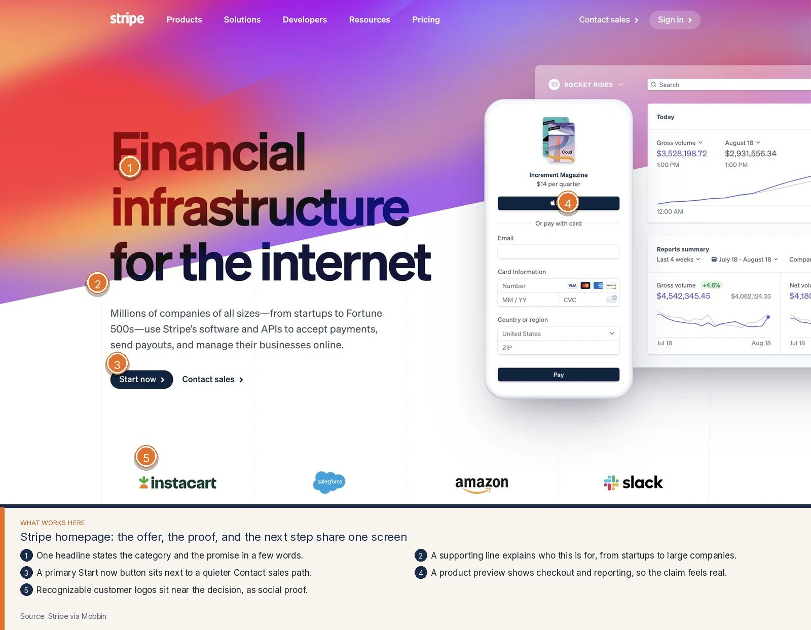
You can follow that structure in your own visual language. Name the thing you sell. Say who it is for. Give one primary next step. Show the product or the work. Place proof where the hesitation lives.
A clear offer and one next step
Conversion problems often start as language problems. The headline talks about innovation, synergy, or being all-in-one. The visitor still cannot answer a basic question: what will I get, and what should I do now?
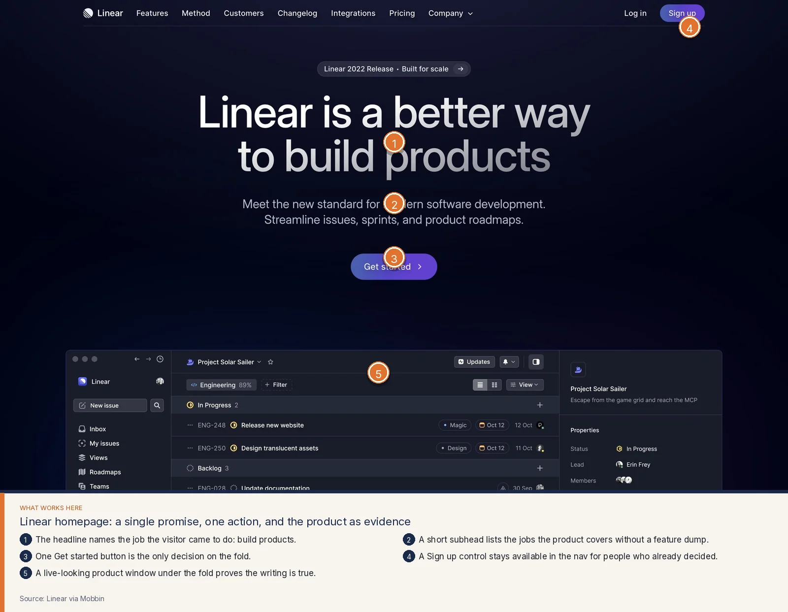
Linear's homepage keeps that answer short. The headline names the job, building products. The subhead lists the work the tool covers. One Get started button carries the fold. Sign up stays available in the navigation. A product window underneath gives the writing evidence.
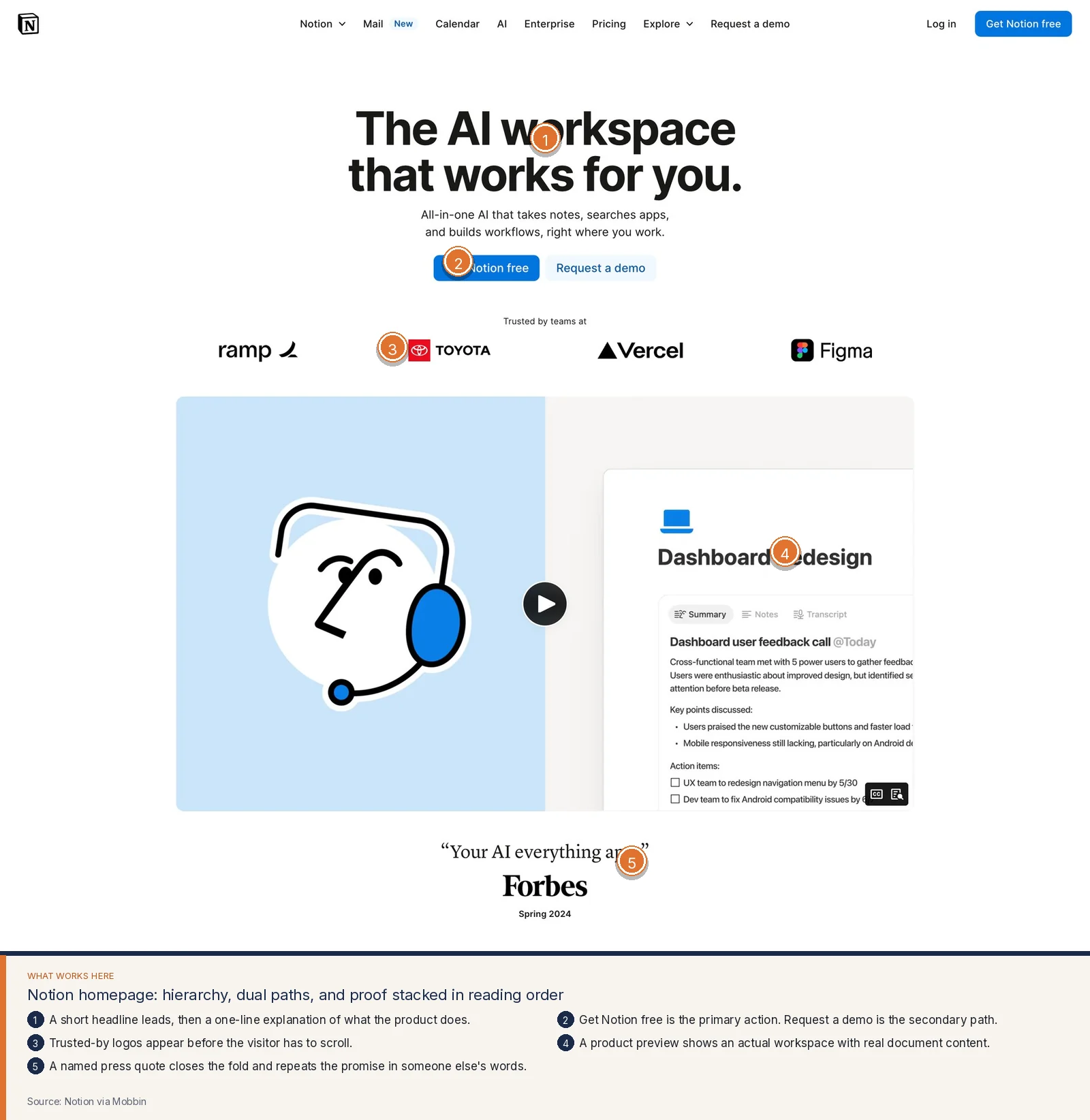
Notion stacks the same ideas in a different visual language: a short headline, a one-line explanation, Get Notion free as the primary action, Request a demo as the secondary path, logos before the scroll, then a workspace preview and a named press quote.
The visitor should be able to recap your offer after a glance. If they cannot, sales and founder time will keep doing the explaining. Good web design earns that glance and chooses one primary action, so the page does not ask six questions at once.
When we rewrite a homepage, we start with five lines:
- Who this is for.
- What they can do after they work with you.
- Why they should believe it, in proof they can check.
- The one action you want from a first visit.
- The secondary action for people who need a longer conversation.
Those five lines are the part AI drafts usually skip. A generator can fill a layout without knowing which of your services pays the bills this quarter.
Social proof that sits next to the decision
Proof works when it shows up at the moment of doubt. A logo row at the bottom of a long page arrives after the visitor has already left. A quote with no name reads as copy. A wall of testimonials with mismatched card styles reads as decoration.
Mixpanel's social proof section talks to the buyer's team in the headline, then shows named people with photos and handles. The cards share one shape. A second row of written reviews sits under those quotes for visitors who want more detail.
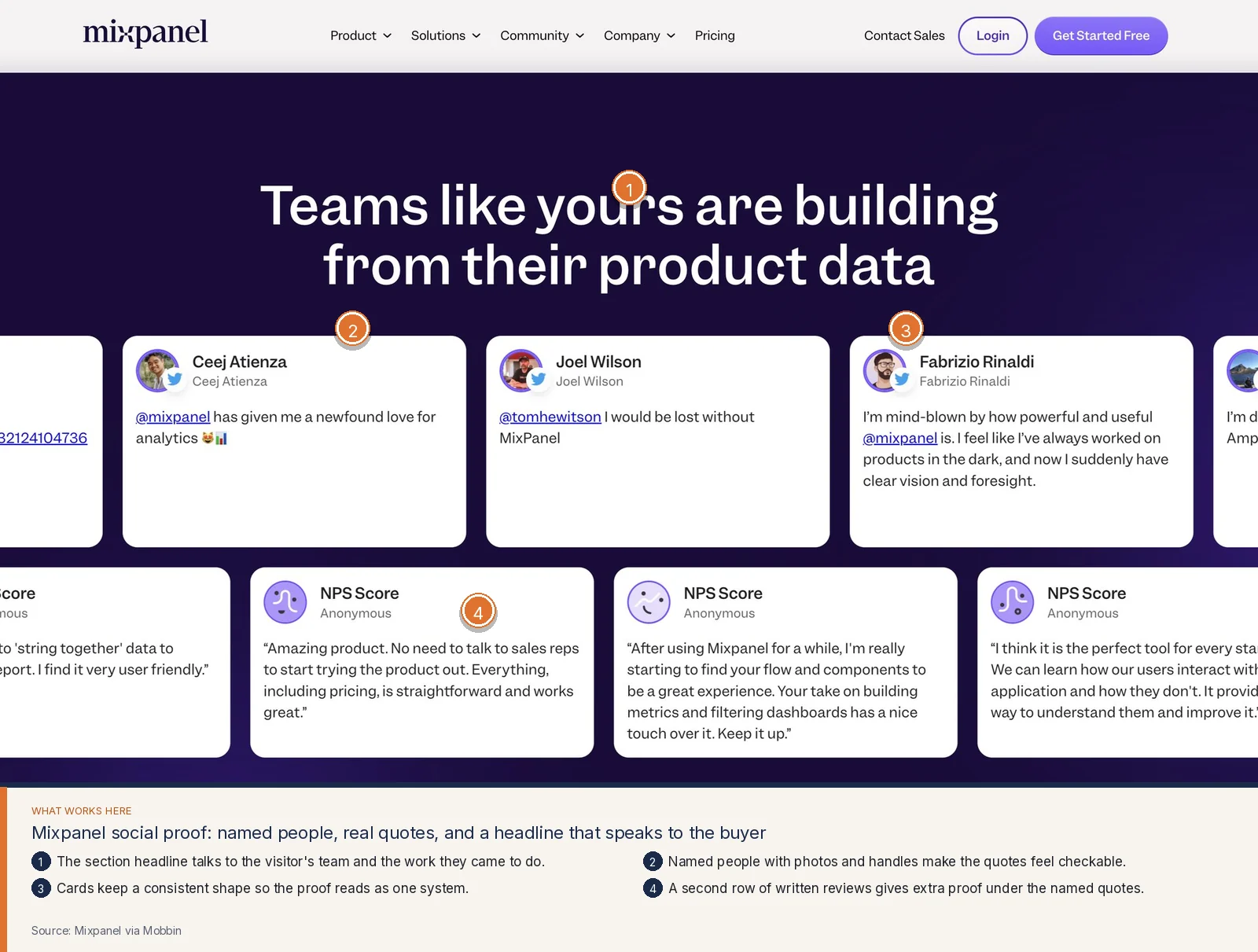
Pick proof that matches the decision on that page. A homepage can carry recognizable customers and one sharp quote. A pricing page can carry logos from teams on the plan the visitor is eyeing. Name the person and the role when you can. Keep the cards in one system.
Investors and enterprise buyers read proof the same way a customer does. They look for signs that other serious people have already taken you up on the offer. A designed proof section makes that scan easy.
Pricing pages that help people choose
Pricing is a design problem. The numbers matter, and so does the way those numbers are compared. When plans use different units, when feature lists change shape from card to card, or when every column shouts "most popular," buyers stall and book a call they did not need. That call feels like interest in analytics. In the room it is often confusion.
Height's pricing section keeps the comparison honest. Three plans sit in matching cards. Each price uses the same unit, per member per month. The middle plan explains what you gain over Free. Sign up buttons match across columns, with a trial called out where it applies. Enterprise gets its own row and a Contact sales path.
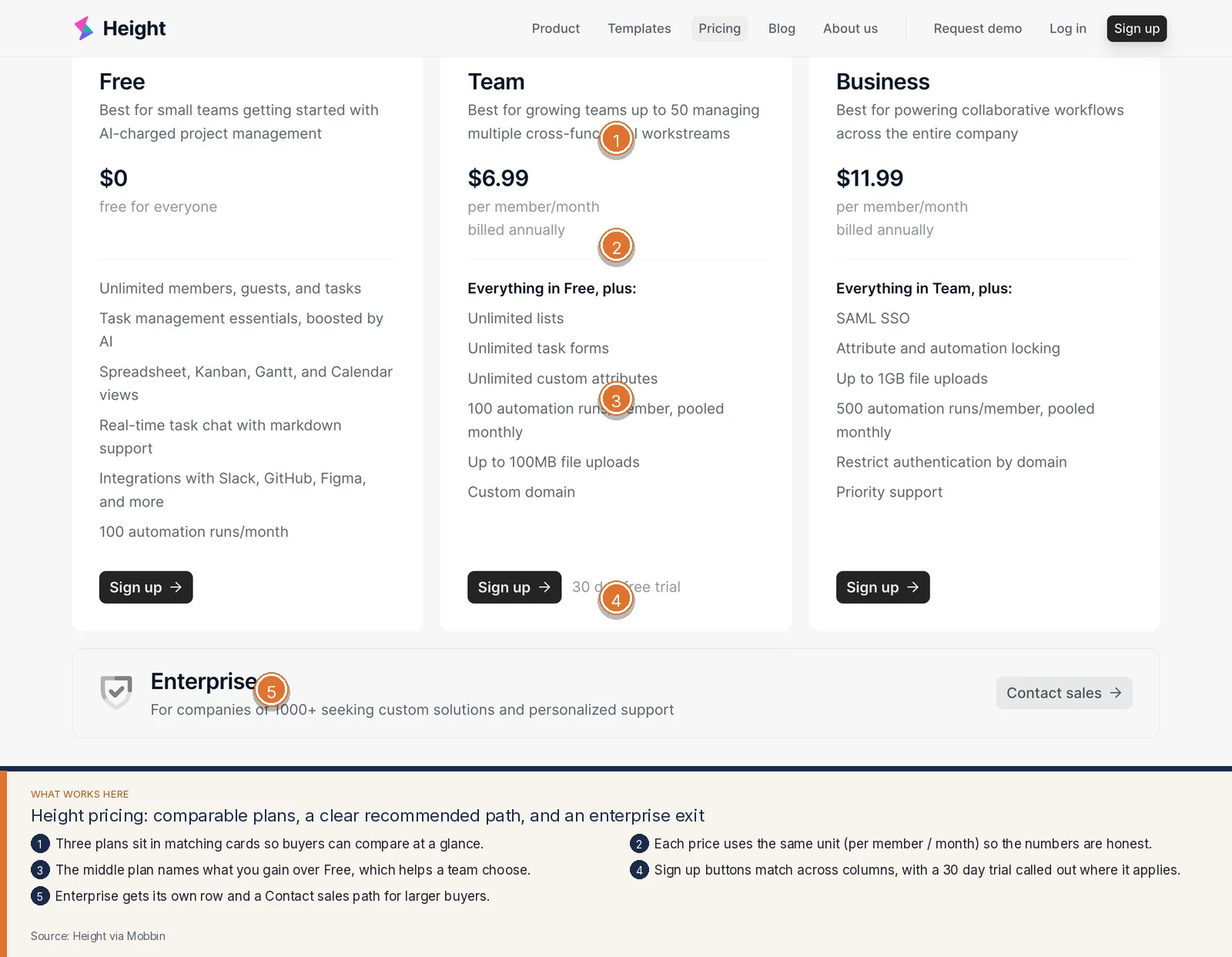
A designed pricing page uses one billing unit across plans, describes who each plan is for, shows what changes when someone moves up a tier, and gives larger buyers a path to sales. Those choices lower the cost of deciding. They also reduce the emails that ask a founder to walk through pricing.
Trust pages that make the promise concrete
Some pages exist to remove a specific fear. Hosts worry about what happens when a stay goes wrong. Patients worry about a bill. Buyers worry about who sees their data. A generic reassurance paragraph rarely settles those fears. A designed trust page names the promise, states what is included, and gives a single next step.
Airbnb's AirCover page does almost nothing except that job. The product name is the visual center. Three short lines spell the promise: protection, always included, always free. List your home stays available for hosts who are ready. The space around the type keeps the eye on the offer.
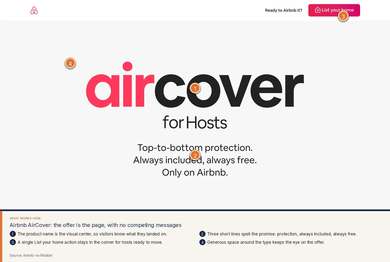
If your site handles money, health, legal risk, or a two-sided marketplace, you likely need a page like this. Write the fear in the heading. Answer it in a few lines a person can repeat. Keep one action visible.
Findability, SEO, and AI search visibility
A beautiful homepage that cannot be found still loses. Good web design includes information architecture: the way pages are named, nested, and written so both people and search systems can tell what each URL is about.
Airbnb's Resource Center opens with a human question, a search box large enough to use, topic chips for common jobs, and a simple map of Homes, Experiences, and Services. A visitor who arrives with a problem can start without reading a sitemap.
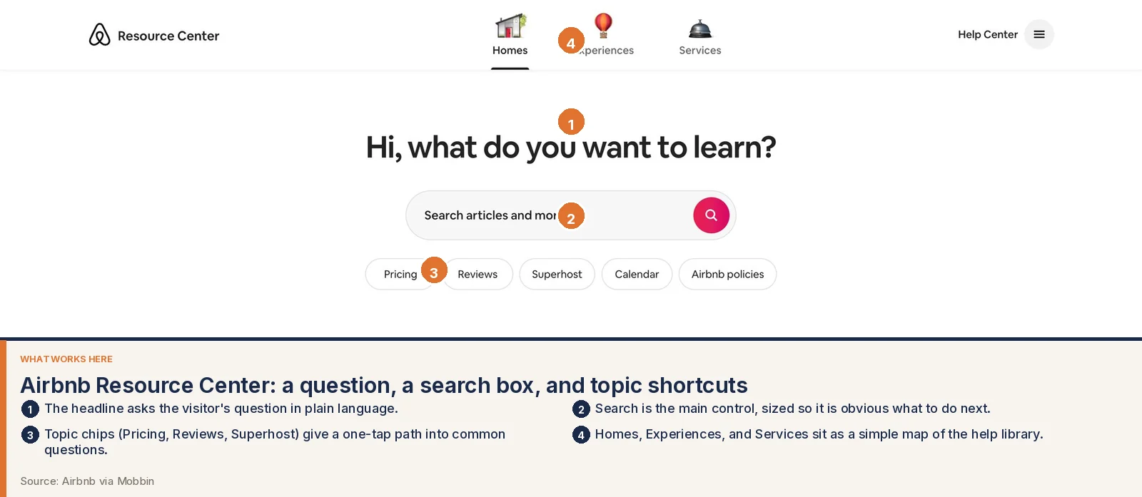
The same discipline helps search and AI answers. Clear page titles, one topic per URL, headings that match the questions buyers type, and internal links make a site easier to retrieve and easier to summarize accurately. A generated site full of interchangeable sections titled "Our Solutions" and "Why Choose Us" gives those systems very little to hold on to. Heading hierarchy, nav labels, and the help center are part of how a stranger understands you, and part of how you show up when someone asks a search box for the thing you sell.
The cost of a site that makes people hesitate
A weak site has a monthly bill, even when you stopped paying the person who assembled it. Sales repeats the offer on every first call because the homepage left it fuzzy. Support answers questions that a pricing page or a trust page should have handled. Paid traffic lands on a page that cannot keep the visitor, so you pay again for the same attention.
There is a quieter cost too. People inside the company stop sending the public page and share a PDF or a calendar link instead, and candidates, partners, and buyers still start on that older, vaguer page.
Good web design pays for itself when it takes work off of humans. The page answers the first three questions. The right people book a call. Your team spends the conversation on fit and scope.
What AI-generated websites usually miss
AI tools have changed the starting point. A founder can produce a full marketing site from a prompt and a logo. The output often looks polished in a screenshot. That speed is useful. It also creates the feeling that the design work is already finished.
The misses show up as soon as a real person tries to use the page.
Generic look-alike layouts. Generators reuse the same hero, the same three feature cards, the same wavy divider, and the same testimonial carousel. Buyers have seen that page on other startups the same week. Nothing about it could only belong to you.
Weak information hierarchy. The visual weight is even. The headline, the subhead, the side notes, and the footer offers all shout at similar volume. The visitor cannot tell what matters, so they read nothing.
An unclear offer. The copy describes values and capabilities. It never states the product, the customer, and the outcome in one breath. The generator has no knowledge of which service you want this page to sell.
Inconsistent components and no design system. Buttons change radius and color from section to section. Cards almost match. Forms look like they came from a different kit. The page has no shared rules, so every future landing page will drift further.
Accessibility gaps. Contrast fails on the overlay text. The form fields have placeholder copy and no labels. The mobile nav cannot be used with a keyboard. Alt text is missing or repeats the filename. These are the details a generator treats as optional and a designer treats as part of shipping.
Flows that ignore real intent and edge cases. The happy path looks fine. Returning customers have no door. Pricing for teams is hidden. The contact form fails without a useful error. International visitors see a single currency and a single language with no note. A designer asks who arrives, what they already know, and what happens when the default path does not fit.
Nothing tested with users. A generated page has never watched a stranger try to explain the offer back. Five conversations will surface the sentence people use for your product, the fear that blocks the signup, and the link they expected to find in the header.
No strategy tying design to business goals. The generator optimizes for a complete-looking layout. It does not know whether this month's goal is more qualified demos, fewer support tickets, a cleaner investor first impression, or a pricing page that can close self-serve. A designer starts with that goal and lets it decide the headline, the proof, and the call to action.
We use AI inside our process to move faster on explorations, variants, and production details. Designers own the judgment: what the page says, who it is for, what it asks someone to do, and whether it is ready to put in front of a customer.
Credibility with investors and buyers
A first-time visitor with a checkbook, a term sheet, or a procurement checklist uses your site as a proxy for how you operate. They notice whether the product screenshots match the current product, whether pricing can be compared without a spreadsheet, and whether the care you claim in the copy shows up in the type, the spacing, and the forms.
The site is part of every inbound evaluation you will not be in the room for, including a fundraising process. A weak page can talk over a strong business. Good web design keeps the public story aligned with the work you have already done. When we work with founders on this, we look at the site the way a skeptical buyer would: what the page promises, what would make that promise believable, and what a person is supposed to do next.
What to invest in first
You do not need to rebuild everything at once. Start with the homepage until a stranger can repeat your offer, the page that explains pricing or how an engagement starts, the page that removes the main fear in your category, and the inner pages search already sends people to. Then lock a short system for type, color, spacing, buttons, cards, and forms, so the next campaign page still looks like it came from the same company.
Start with a clear picture of your site
If you are deciding whether to invest, begin with evidence from your own pages. We offer a free UX Scan that reads a URL and flags hierarchy problems, weak calls to action, accessibility gaps, and places where the offer gets lost.
Run a free UX Scan on your site, then book a discovery call. The first call is online. You can also email ash@uxsignalstudio.com. Tell us what the site is supposed to do this quarter, and we will tell you whether design is the constraint.