Why You Should Invest in Great Product Design
Product leaders are under pressure to ship. AI tools now draw onboarding screens, empty states, settings pages, and entire dashboards from a prompt. The output looks like a product. Teams paste the frames into a ticket and feel the design work is behind them.
Users experience a path: can I start, can I tell what happened, can I finish the job I came to do, and will I come back tomorrow? When those answers are fuzzy, activation stays low, support stays busy, and people churn while still describing the product as powerful.
We are a Bay Area boutique studio. We design product UX, websites, brand, and launch video. The first call is online. This piece covers onboarding and activation, retention, support cost, the speed a design system gives a team, pricing power, accessibility, and trust in fintech, health, and AI products. It also names what AI-generated product screens miss, and what a designer adds before those screens meet a customer.
Activation starts with a welcome that tells the truth
The first session decides whether someone becomes a user or a row in an abandoned-signup report. Great onboarding confirms the person is in the right product, states the deal in language they can repeat, gives new users one obvious door and returning users a second door, and asks only for the information that will change what happens next.
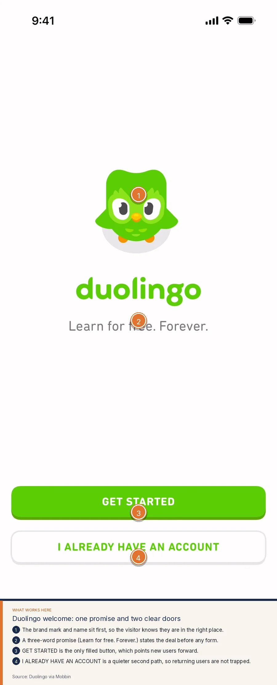
Duolingo's welcome screen is a clean version of that sequence. The mark and name come first. A three-word promise, "Learn for free. Forever.," states the deal before any form. GET STARTED is the only filled button. I ALREADY HAVE AN ACCOUNT is a quieter second path, so a returning learner is not dropped into a new-user flow.
The next step keeps the same respect for the user's time. A progress bar shows how much setup remains. The mascot asks a human question, "How much French do you know?" The answers use one pattern, with signal bars that preview difficulty. CONTINUE stays pinned at the bottom.
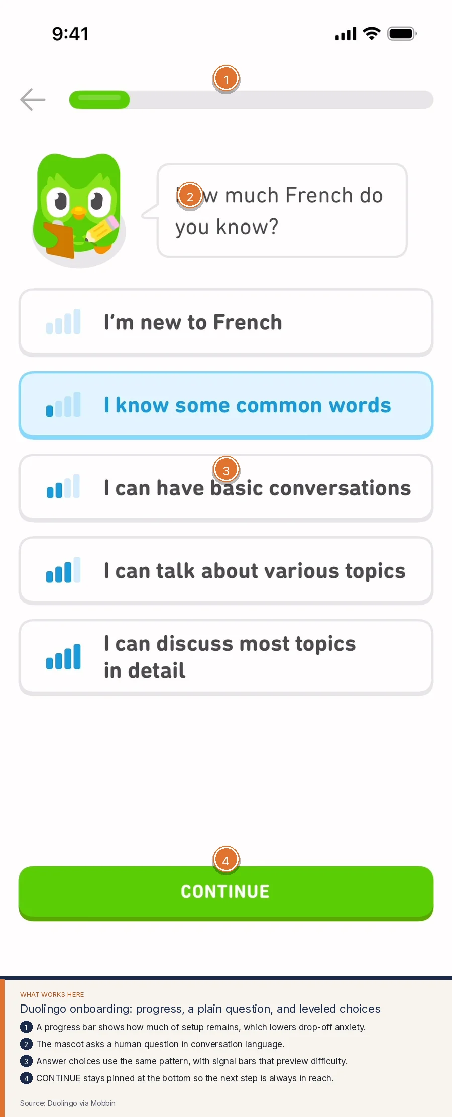
The product learns enough to place the person in the right lesson, and the person learns enough to feel the product was built for them. A generated onboarding flow often asks for name, company size, role, use case, and integrations before anyone has seen value. Each extra field feels cheap to add and expensive to complete. A designer asks which answers change the first experience, and removes the rest.
When we work on activation, we map the first session as a story:
- What the person already believes when they download or sign up.
- The smallest proof that this product can help them today.
- The questions that must be asked to deliver that proof.
- The states for people who have been here before, who get stuck, and who need to skip.
That map is the investment. Screens come after.
Empty states and the second session
A surprising number of products look finished in a demo and vacant after signup. The user arrives to a blank canvas, a chart with no data, or a home screen that only knows how to celebrate a full account. The second session is where many products lose the people they worked so hard to acquire.
Notion treats an empty page as a teaching surface. The title is ready to edit, so the first job is naming the work. A Get started with row offers starter types: notes, a database, a form, templates. The sidebar and top chrome stay the same as a filled page, which teaches the system while the page is still quiet. Share and comments sit in a predictable place for later.
Revolut does the same job with money on the line. The home screen leads with the balance, which is the first question a customer has. Add money, Move, Details, and More sit as a consistent action row. "No transactions yet" is an honest empty state that explains the quiet screen. Products for you offers a next step, with Open buttons. The bottom nav keeps Home, Invest, Payments, Crypto, and Lifestyle in one system.
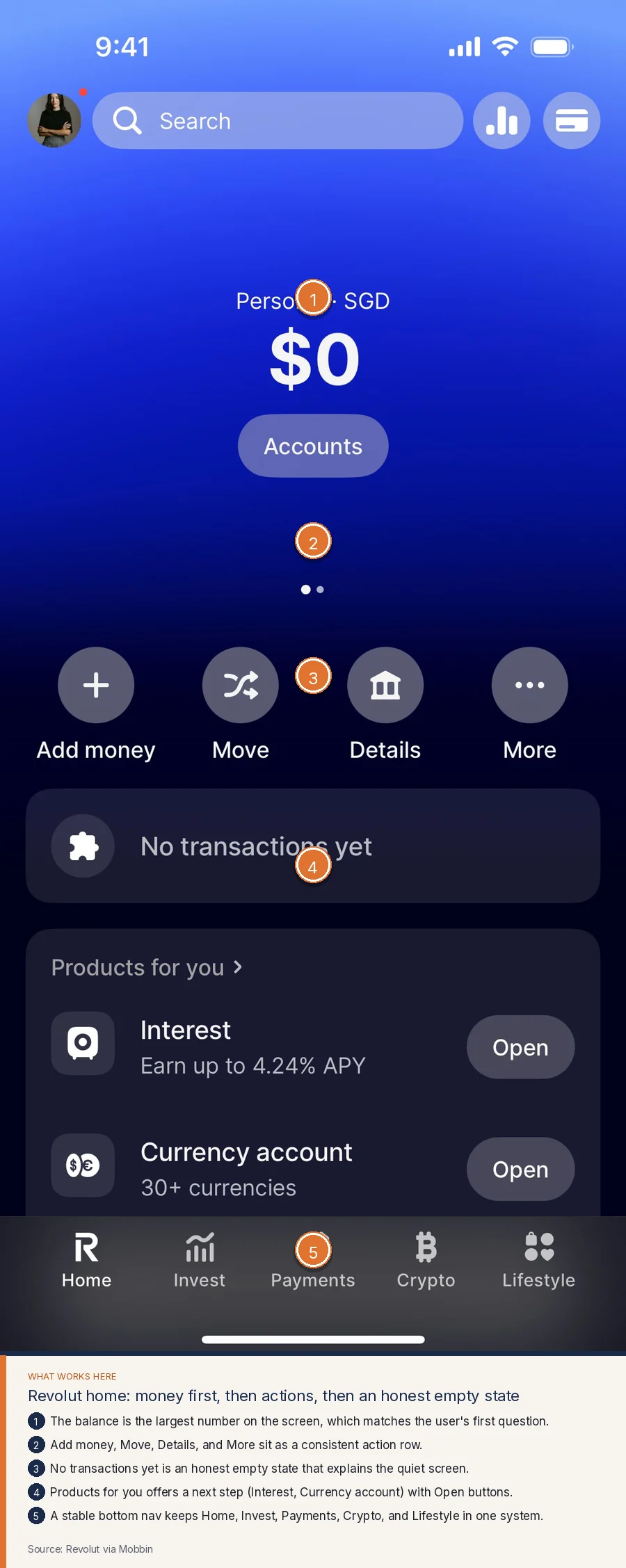
Empty states belong in the same pass as the happy path. They tell the user what this screen will become and how to take the first step. They also prevent the support ticket that asks whether the product is broken. A generated dashboard often leaves the blank hole as blank. A designer writes the sentence that empty screen needs.
Retention lives in the home you return to
People stay with a product that makes the next useful action obvious every time they open it. That is a home screen problem, a notification problem, and a content problem, and all three are design.
Headspace's Explore view keeps a current program visible, with session count and time, so a returning member can continue without hunting. Collection cards share one layout: title, a short description, and an illustration. The copy on each card tells the visitor what they will get before they tap. Today, Explore, and the profile tab stay consistent at the bottom.
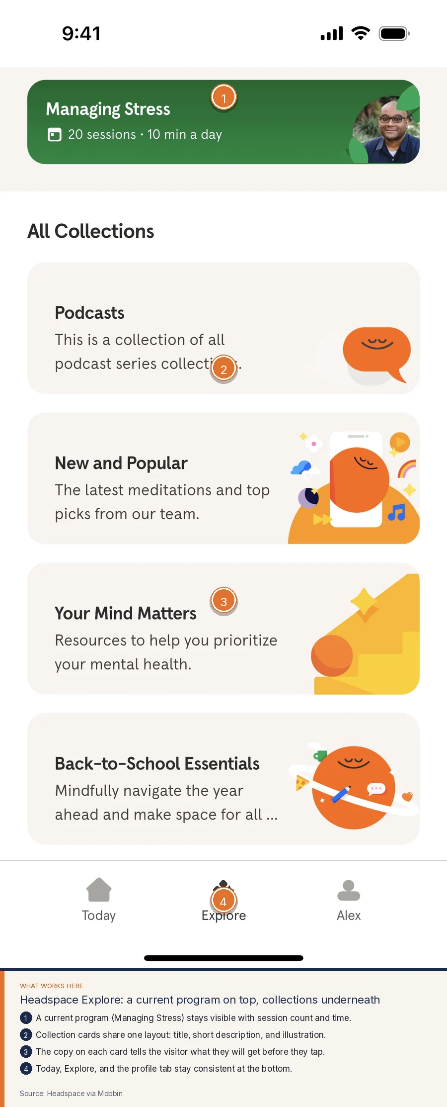
Retention design is full of these quiet decisions. The last session should be easy to resume. The library should be scannable. The navigation should stay stable across releases. Progress should be visible. AI can propose a layout for a home screen. A designer decides what "home" means for this product: resume, discover, check a balance, clear a queue, or talk to a teammate. Campaigns can bring people back. The home screen has to be worth coming back to.
Checkout, money, and the cost of doubt
Any flow that takes a card, a transfer, or a subscription is a trust surface. People look for the total, the payment choices, a reason to believe the number is being handled with care, and a way to understand what happens after they tap.
Shopify's subscribe checkout keeps those pieces in view. Payment methods are listed as choices, with card details grouped under the selected one. A lock icon and card brand marks sit next to the number field. Amount due is visible above the button. Subscribe is a single full-width action. Change or cancel language sits under the button, which is the moment people look for it.
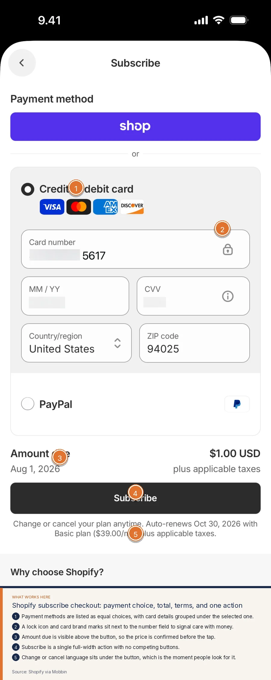
Doubt at checkout has a direct cost. People abandon the flow, write to support, or complete the purchase and then argue with the charge because the terms were easy to miss. Great product design puts the price, the method, the security cue, and the terms in the order a nervous person searches for them. It also designs the error states, which is where generated screens go quiet and where users decide whether they trust you with money a second time.
Support cost is a design metric
Every confused empty state, unlabeled form, and hidden settings control becomes a ticket. Many of those tickets are the product asking a human to explain what the interface should have said.
We look at support queues as a map of design debt. "Where do I find X" is an information architecture problem. "What does this status mean" is a language problem. "I think I did this, did it work" is a feedback problem. Designers can retire those questions with clearer labels, visible confirmation, and paths that match the words customers already use.
The return shows up as fewer tickets per active user and a team that can spend its attention on the cases that truly need a person. A customer who can solve a problem late at night without writing in will remember that at renewal.
A design system is how you ship faster
Speed is one of the reasons teams reach for AI. They want more screens in less time. A design system gives that speed a memory. Components share behavior. Spacing follows a scale. Color means the same thing on every page. Filters, empty states, and dialogs do not get reinvented every sprint.
A Figma design file is a daily example. Pages and layers stay in a persistent sidebar. Website frames share one board, so Home and About can be compared. Text styles and color styles live in a single inspector, which keeps heading weights and brand colors consistent. Design and Interaction stay available in the same panel. The toolbar keeps shared tools in a fixed place.
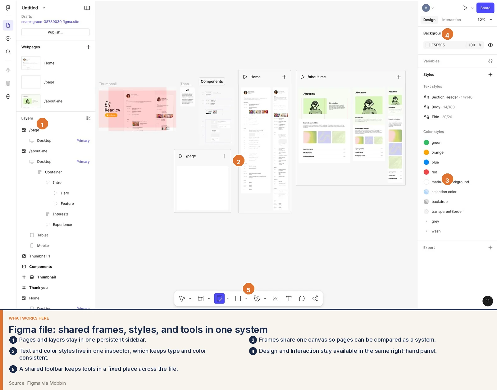
This is what an investment in product design buys a growing team. Engineers stop waiting on one-off mockups for every row state. New features inherit patterns. Marketing screenshots stay honest because the product looks like one product. AI can help produce variants inside that system. Without the system, each generated screen is a fresh invention, and the app slowly becomes a pile of almost-matching parts.
Pricing power, accessibility, and who can use the product
People will pay more for software that feels reliable and considerate. That feeling comes from paced onboarding, honest empty states, calm checkout, and a visual system that does not fight them. Pricing power grows from those product moments.
Accessibility is part of the same investment. It is how more people can use what you already built, and it is how you avoid shipping barriers you will have to unwind later. Designers check contrast, focus order, labels, hit targets, motion, and whether status is conveyed by more than color. They write error text that names the fix. They make sure a screen reader can follow the same path a pointer can follow. AI-generated screens often miss these details because the screenshot looks fine to a sighted person scrolling quickly.
In regulated and high-trust categories the stakes rise again. A fintech home screen that hides the balance or invents a cheerful empty state for a failed transfer will not be forgiven. A health product that leads with medical codes, or that hides the next clinical step, will generate calls and fear. An AI product that cannot show its limits, its sources, or a way to undo an action will feel reckless even if the model is strong. Trust in these products is a design outcome: hierarchy that leads with the number or the takeaway the user came for, language that matches how they speak, and controls that make reversal possible.
The pattern repeats across those categories. Put the answer above the internal detail. Design the failure. Keep a human path available when the stakes are high.
What AI-generated product screens usually miss
AI tools make it easy to fill a file with screens that resemble a mature app. Founders and product managers can sit with that file and feel they have designed the product themselves. The illusion is understandable. The frames have tabs, cards, and a color palette. They photograph well in a deck.
The misses appear when someone tries to live in those frames.
Generic look-alike layouts. The home screen uses the same card grid as a dozen other generated apps. Nothing about the layout encodes how this product is actually used on a Monday morning.
No real information hierarchy. Every module has the same visual weight. The number the user came to check sits at the same scale as a promotional tile. The eye has no place to land.
An unclear offer inside the product. Onboarding describes features. It never states what success looks like after day one, so people wander and leave.
Inconsistent components and no design system. Primary buttons change from screen to screen. Lists use three different row heights. Sheets, dialogs, and toasts feel borrowed from separate kits. The team will pay for that drift in every sprint that follows.
Accessibility gaps. Icons sit in buttons with no accessible name. Contrast fails on the pastel badges. Custom controls skip keyboard access. Dynamic type breaks the layout because the screen was drawn at one size.
Flows that ignore real user intent and edge cases. The happy path is pretty. The path for a returning user, a declined card, a permission denial, a zero balance, a delayed result, or a team member with less access was never drawn. Those are the paths that create support volume and public reviews.
Nothing tested with users. No one watched a person try to invite a teammate or complete a first task. The labels that seemed obvious in the prompt turn out to be internal jargon.
No strategy tying design to business goals. The generated file does not know whether the company needs more activated teams this quarter, fewer tickets, a higher conversion to a paid plan, or a calmer experience for a regulated audience. A designer starts with that goal and lets it decide the first session, the home screen, and the empty states.
We use AI to explore directions and to move faster on production once the system exists. Designers own the judgment: which job the screen is for, what can be removed, what must be handled as an exception, and whether a person outside the company can succeed without help. That judgment is what a generated file cannot supply, even when the frames look complete.
What to invest in first
Look at the path that creates the most value and the most confusion, and design that path end to end. For many startups that path is:
- Signup and the first session, until a new user reaches one meaningful outcome.
- The home screen they will see on visit two.
- The empty and error states inside that path.
- Checkout or upgrade, if money changes hands there.
- The component system that will keep the next ten screens coherent.
Do that work with real users in the room, even if that means five calls. Then let AI help you produce volume around a system that already knows what it is doing.
See the friction in your product
If you want a clear view of where design is costing you activation, trust, or support time, start with evidence. We offer a free UX Scan that reads a URL and flags hierarchy problems, weak calls to action, accessibility gaps, and flows that hide the next step.
Run a free UX Scan, then book a discovery call. The first call is online. You can also email ash@uxsignalstudio.com. Tell us what the product is supposed to help someone do in their first session, and we will tell you whether design is standing in the way.